| You may have seen her pretty face around town, and if you’re lucky you also would have seen this Brisbane artist’s beautiful hand drawn works at your local haunts, exhibitions and on your Instagram feeds (especially if you follow us on Instagram)! Introducing Leona Fietz – graphic designer, typography artist and the gifted gal behind The Print Bar’s current inhouse chalk board creation!
Without doubt she is an artist to learn more about and someone to keep your eye on (because she is not an artist who sits still for long!) Take a minute to meet and greet the lovely Leona Fietz while she chats with us about about type, art and her upcoming exhibition this weekend! |
|
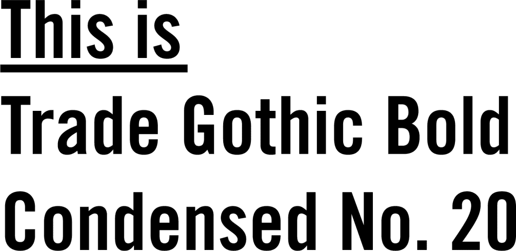
What makes typography so special to you? I’m a pretty straight forward person naturally, so its the perfect medium for me to express myself creatively… I love that I can put down however I’m feeling at the time on paper, its a pretty cathartic process! Also the long history thats linked to print, our language, culture, social status and the way it lends itself to cross over between fine art and design. I get a kick out of fussing over the details – this can prove to be a flaw and setback in everyday life sometimes – but comes in handy when I’m fiddling with spacing of letters, proportions and stress weights of letters for hours! If you were a typeface which one would you be and why? Trade Gothic Bold Condensed No. 20 – straight up and down. |
What are the top 3 mistakes graphic designers make when they are dealing with typography?
Alright I’m no typography police, but I would say using more than two or three fonts in the one design almost always confuses the message! Also maybe choosing the wrong fonts to begin with or using them in a format the font designer didn’t create them for.
Leona’s Top Tips to hand draw type?
– You have to learn the rules before you can break them! So study and practice the anatomy and history of typography as much as you practice and experiment.
– Put your Wacom pen on a leash, get a proof reader pal to always check your spelling – I wish paper and Illustrator had spell check!
– Rely on the theory and history of typography rather than trends.
Who are some current day artists/agencies who really inspire you as a designer and/or typography artist?
Kate Morross, Frank & Mimi, Jessica Hische, Gemma O’Brien, Mike Perry, Stephen Powers, Erik Marinovichand Jon Contino.
Where do you usually source material from for new works?
For style and technique I have a stack of go-to reference books – anything Stephen Heller & Louise Filli had something to do with, Ellen Lupton’s theory books and type history collection books edited by Cees W. de Jong &, Alston W. Purvis, Jan Tholenaar. I’m always writing notes and phrases in my phone or sketchbook that come up from conversations and banter with friends, lines from documentaries and interviews, lyrics. I enjoy a lot of wordplay too; adding double meanings, deconstructing and linking different words together.
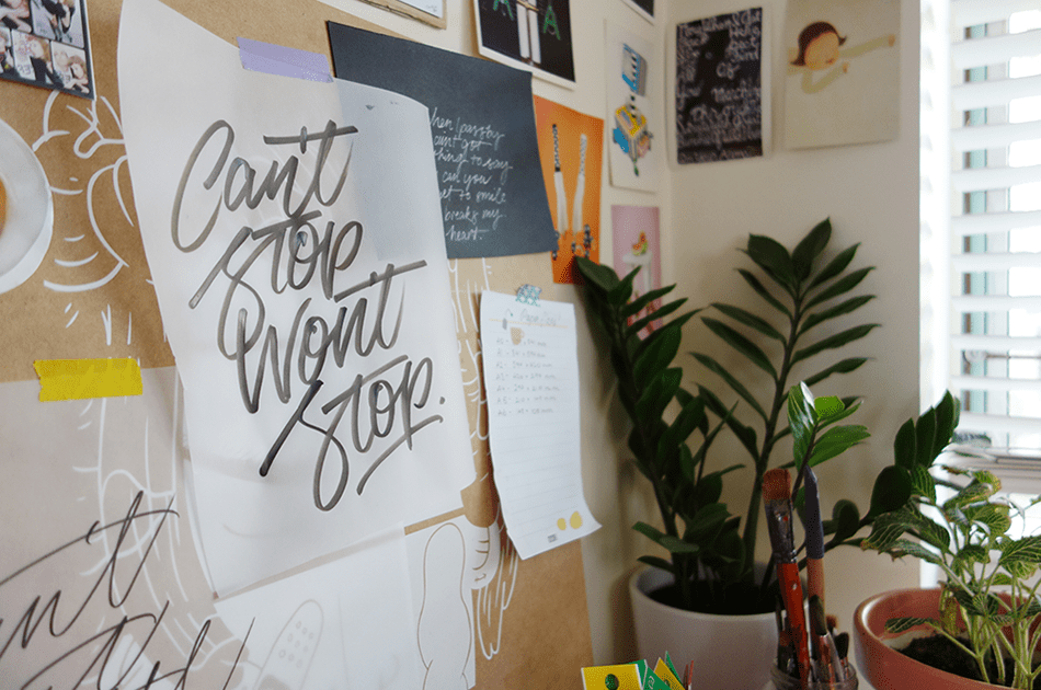
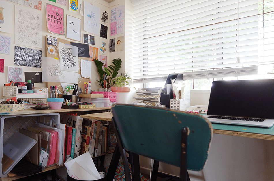
The old saying “the pen is mighter than the sword” is a pretty relevant saying that rings true still. Words can be pretty powerful – what are the reactions you generally receive about the pieces you create? Do you set out to make a point with your work, or is it more about your process and a personal snap shot of your life in that moment?
Yeah you got me! – almost always what I’m saying in self initiated pieces directly reflects my mood at the time. Any self initiated work is created basically for myself or a friend, like a extension of my inner monologue, a note to self to keep pushing forward. The most common reaction to my work is friends or followers saying they can relate, or will start a conversation about the topic – which is a pretty nice result.
What is your process when creating new works, especially commissions?
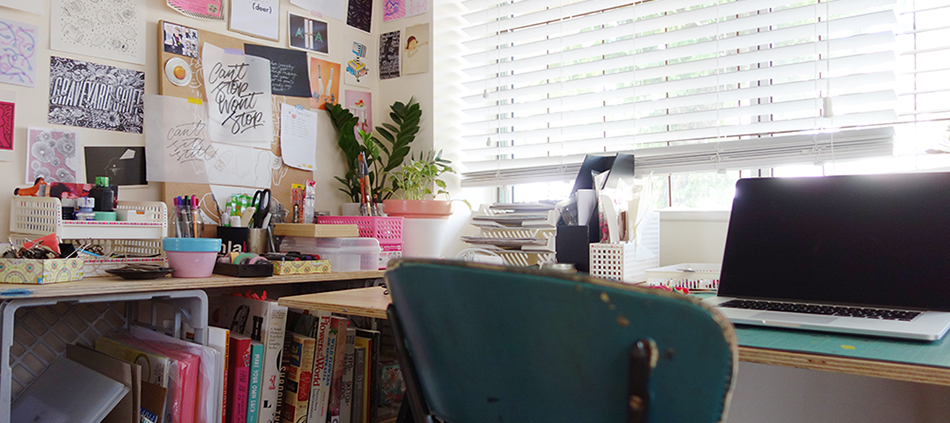
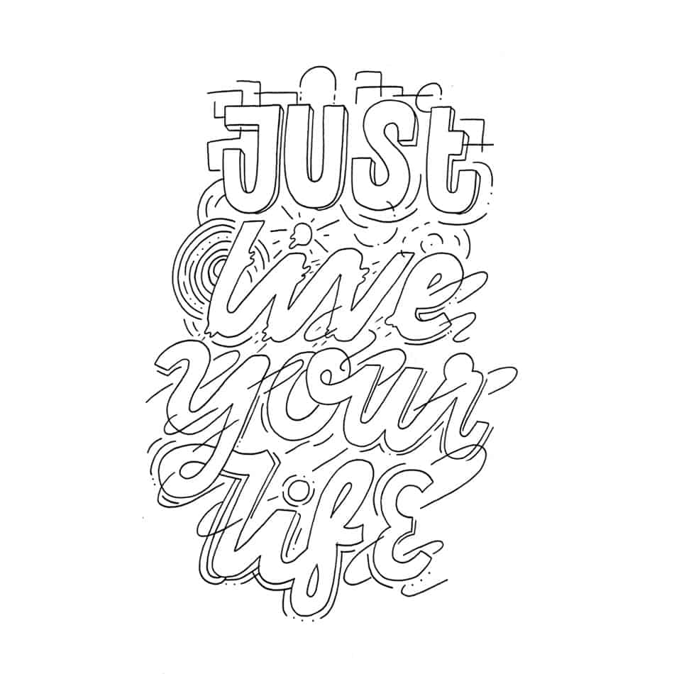
I always start with pencil sketches to get the form of the letters and composition right. Then do a few different style variations, scan them in. After its approved, I get into illustrator (or onto paper) – set up a baseline, angles, grids if need be depending on the style. Then loosely trace straight over the sketch with the Wacom pen using the pen tool or if on paper trace a final with my light box. After I’ve drawn the basic form I’ll bulk it up with decoration and thicks, colour etc.
What’s next for you?
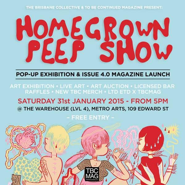
I’m live painting for the first time at The Brisbane Collective “Home Grown” Exhibition on the 31st of Jan!!Working on chalk board art for a local cafe, finishing a couple of zines and working on putting together new artworks for a group show.
Want to know more? Visit Leona:
Leona Online / Leona on Tumblr / Leona on Instagram or in person this weekend at the Homegrown Peep Show!
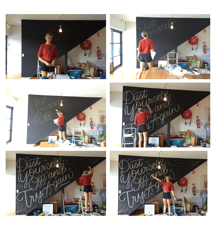
Behind The Scenes Snaps – Leona’s Chalkboard in Progress:
Here’s some behind the scenes pics of Ms. Fietz turning The Print Bar’s chalkboard wall into a typographic masterpiece while our team custom printed t-shirts into the early afternoon!
Keen to go chalk mad on our chalk board?
Email (marketing@theprintbar.com) with a link to your work and a proposed artwork you’d like to share!

